Subscribe via email

Enter your email address:

Delivered by FeedBurner

Subscribe Now: Feed Icon

Tuesday, August 23, 2011

A chef's kitchen

Moving into a new home or condo can sometimes be quite an adjustment
For this client, this kitchen below (the BEFORE) was just not going to work

By opening up the wall in between the original kitchen and dining room, the space automatically visually increased
Redoing the layout of EVERYTHING (where appliances went, the cabinetry floorplan) and adding new floors created a whole new fantastic space
These clients LOVE to cook and entertain and this was the best design for their wants
As you can see, only part of the drywall soffits were removed but incorporating that into the design from phase 1, we were able to create a design that is still visually pleasing
Love the granite backsplash and the french door refrigerator

Cabinetry used in this kitchen was from my "Quality Cabinet" line; Maple Quincy in Dulce on island, and Sussex Thermofoil in White.

By arching the back side of the island's granite, we created an illusion of a deeper island
This kitchen is perfect for entertaining and still allows for plenty of storage
The island boasts deep drawers for pots/pans, space for spices, trays, cutting boards-all which is perfectly located by the cooking source
In addition to their kitchen, are four baths done in "Quality Cabinetry" below


Thursday, April 28, 2011

Small but mighty design

Tinsie tiny but no compromise on function or style!
This Huntington Woods remodel was an adorable space to work on.

I used "Medallion Silverline" cabinetry in the Lancaster style, painted Maple-Divinity finish


A large wood hood that kisses the ceiling draws your eye up creating a larger visual space
I love the client's choice of plated pottery to display on the mantel
Don't be fooled, this darling hood has some serious power!

 BEAUTIFUL Quartz counter tops are a great alternative to granite or marble and are VERY durable
Isn't this color and pattern amazing?!
 I love the sea glass blue subway glass tile with this misted gray Quartz tops...so serene and calming
 Classic Bin pulls on drawer head adds detail while flatter knobs on doors are perfect for grabbing

As a fellow cooking enthusiast, I love my client's choice of a BIG bold range and 2nd oven next to it!
Not the best picture but you can see all the cooking glory that must happen in this kitchen

For all the Men out there...yes, look at this TV.
For all the Ladies, it folds up and away when done with use :)
Very practical, I would have it permanently set on FoodTV or Cooking Channel (or..CNN..er..I mean Bravo)
 Even though small in width, these glass uppers offer a visual break in cabinetry for display of glassware
 6" is all it takes for 6 bottles of wine...hmm, seems one bottle was enjoyed :)
This cabinet is over the refrigerator and out of children's reach
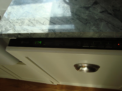
 I am a big fan of paneling a dishwasher.
Easier to keep clean and just keeps such a fluid look going with cabinetry
 Opening it up reveals it's true identity of indeed a quiet DW
 What is more inviting than a beautiful farmer's sink, and set on an arched toe for a further furniture look

And now, for some interior goodies:
We wanted to hide an inexpensive microwave, inside the upper cabinet, so I increased the depth to a 15" depth to accommodate this unit.

A blind corner cabinet.
The pie shelf swivels out and behind it are two more rollouts that pull forward, utlizing all dead space!
Even 3" spaces can be utilized
Tiny spice pullouts that actually hold a lot


Now, if you are thinking "My kitchen is too small to do anything amazing" I hope you see the great  possibilities!

Wednesday, April 20, 2011

Island for 5...or more!

This Huntington Woods Remodel was a total blast to work on for this family
The cabinetry I designed with here is Quality's Manchester Maple in Dulce stain
Isn't this just a perfect island for a family?
The island is approximately 39" wide by 128" long!!!
Allows for seating of 5
Yes, FIVE!
The family tells me not only do they enjoy their new kitchen but the island has become a gathering place for cooking together, doing crafts and still leaves plenty of space for Mom/Dad to work/cook uninterrupted.


These stool adjust in height to reach the island height of 36" high

Here is a "BEFORE"
And the "AFTER" of that same wall
We embraced the two smaller windows by lifting them higher off the ground so we could run cabinetry underneath and using the wall space as our cooktop focal point.
The family loves their induction cooktop
By running cabinetry and tile up to the ceiling, it makes their 8 ft ceiling appear much taller

Wait..is the main sink not facing a window?! 
Yes...people, it's ok...you can do that and have it look appropriate and work beautifully
We embraced it by creating an interesting wall of balanced upper cabinetry, lifting the glass cabinet above the sink up to allow for comfort while at the sink.
Function wise, it's perfect

By pairing tall verticals, such as the Refrigerator by the double oven/micro keeps from breaking up countertop space  AND allows for quick reheating of meals

My client LOVED her kitchen aid top oven/micro/toaster unit with full size oven below


A small 'veggie' sink equipped with a garbage disposal makes prep help a breeze

We special ordered 6 pullouts for this client to meet their needs of organizing smaller items in their pantry
Snack storage at the end of the island is easy for children to reach and help themselves
It's easy to keep Kosher with proper space and organization
 

Double Trash/Rec pullout

***
 the "BEFORE"
 &
"AFTER"

***
In addition to the kitchen, we converted an old pantry closet into a family room desk area.
It's multi purpose of crafting, homework, bill paying, emailing, etc suites any family well

All installation and remodel work was done by Gordy Oliva 
Cabinetry designed and provided by Kristen with Midwest Cabinet & Counter